Colors
Briar’s color scheme offers enough flexibility to account for various use cases while keeping every color shade distinguishable.
Lime
Blue
Orange
Red
Dark
The dark palette is primarily used for interfaces that are adapting a night theme. Shades of it can be used as backgrounds, borders, and shadows to emphasise certain areas or set them apart.
Gray
The neutral palette is primarily used within components to help differentiate hierarchy. Shades of gray can be used as backgrounds, borders, and shadows to emphasise certain areas or set them apart.
Spacing
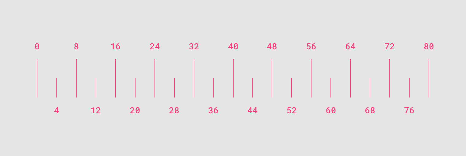
Briar uses Material Design spacing guidelines for both Web and Android platforms. Material Design layouts encourage consistency across platforms, environments, and screen sizes by using uniform elements and spacing. Material Design layouts are visually balanced. Most measurements align to an 8dp grid applied, which aligns both spacing and the overall layout. Smaller components, such as iconography and typography, can align to a 4dp grid.

Typography
Briar’s typography system slightly differs from platform to platform. On the web, we use a slightly modified version of the Material Design typography guidelines using the Inter typeface by Rasmus Andersson and Roboto Mono for code snippets and other cases where a monospace font might be required.
| Scale Category | Font Weight | Size | Case | Letter spacing |
|---|---|---|---|---|
H1 | Light | 96 | Sentence | -1.5 |
H2 | Light | 60 | Sentence | -0.5 |
H3 | Regular | 48 | Sentence | 0 |
H4 | Regular | 34 | Sentence | 0.25 |
H5 | Regular | 24 | Sentence | 0 |
H6 | Medium | 20 | Sentence | 0.15 |
Subtitle 1 | Regular | 16 | Sentence | 0.15 |
Subtitle 2 | Medium | 14 | Sentence | 0.1 |
Body 1 | Regular | 16 | Sentence | 0 |
Body 2 | Regular | 14 | Sentence | 0 |
| Medium | 14 | Sentence | 0.5 | |
Caption | Regular | 12 | Sentence | 0.4 |
Overline | Regular | 10 | All Caps | 1.5 |
Links
In paragraphs (not UI components) links are underlined for accessibility reasons.
Monospace
briar://adotxjsvndqs5olgvplspnyhaptdsaewfsddfcwasrfredj98jidhnbfsicnjdfngksdhujnlglahnd
In some cases (such as code snippets or contact links) a mono space typeface is required. We use Roboto Mono with a slightly darker or lighter shade background to distinguish the snippet from other text.
Icons
Briar uses the Material Design Guidelines for both Web and Android iconography. Please refer to these guidelines.
Illustrations

Chat Doodles Black

Chat Doodles Subtle

Chat Doodles Subtle Dark

Chat Doodles Subtle Lime Dark